Of course the first test of the iPad Pro’s camera I make, is a picture of Willow, lol.

Since my phone is usually tossed in a corner somewhere, when I’m home most dog photos I take are taken by my tablet. Because that’s the camera I have without walking into another room 😛. Having a camera that doesn’t suck versus my Galaxy Tab S3’s was part of the logic in going for the 11” Pro, alongside my distaste for replacing all my USB-C with that Lightning bull crap.

I think the decision is largely made at this point. The fruit company is my tablet computing destination, whether I like it or not.

The dire lack of Android tablets with a stylus, the Q/A that matches Chrome OS’s rapid release cycle, and the shrinking number of companies making a ‘real’ Android tablet that is worth my time, has had me considering jumping ship for a while. Google’s pox upon multitasking making its way to my Tab S3, is pretty much the straw that broke the camel’s back.

Most of the software that I run on my Tab S3 supports both iOS and Android. Alternatives exist for the more systemy stuff at the edges, like the corporate printer or dealing with my file server. Pretty much if I find an analog to FolderSync Pro, the only thing I’ll really be losing software wise is free editing support for Microsoft Excel and Word. Before ending up with a Samsung that bundled MS Office, my long term solution was OfficeSuite Pro which has enough compatibility to handle documents at work. So for the most part I’m not worried much about software. It also helps that by living in Android land so long, iOS has been working its big boy shorts for while now instead of their update notes sounding like a baby’s toy.

When the 1″ crack in my Tab S3’s screen becomes terminal, I’ll have little option but to replace it one way or another, and I have had a very long time now to contemplate what that will be. For now I’m just happy the what the hell moments related to the crack are few and far in between versus my heavy tablet use.

In Android land: the only things that are viable replacements are the Tab S4 and S6, which are old and new successors, respectively. Negatives to both are they will also come with Google’s pox and they’re widescreens. DeX isn’t going to fix what Pie did to multitasking and I greatly prefer 4:3 and 3:2 tablets.

No Chrome OS device exists yet that aligns with my requirements, and the only ones worth paying for are too big to replace my Tab S3. And that just leaves iPads. Which for as little love as I have for Apple, and my lack of caring for iOS, solve the problem Android has been most screwing me with the longest–there’s a lot more freaking iPads to choose from that support a decent stylus than their are Android devices with a decent stylus.

It’s always been hard to find an Android tablet with a nice stylus, and Samsung while expensive has filled that role pretty swell. But they’re kind of becoming the only vendor to choose from, both in terms of an Android tablet that meets my requirement for stylus, and Android tablets in general.

I also find it kind of funny how this works out. In the old days when Android tablets were quite new, I found the iPad excessively overpriced and Android underappreciated; Apple has at least solved that with their expanded selection. Likewise, most new iPhone launches were followed by me scratching my head and wondering how people lived so long without essential features; iOS release notes stopped feeling like a slow as hell iteration several years ago.

And then there’s the fact, that I’ve never actually owned an Apple product. I’m more at home with an xterm than a Mac. More than a few of my friends have soft spots for fruity products, and have since at least as far back as the iPod and PowerBook. Me, never have. But I suppose there is probably a first time for everything.

Pie sucks at multitasking

Things that Pie has wrought: Google’s curse.

Overview now has a more useful grid like view. Aside from the nauseating effect that happens when closing an app makes them all resort but at least it is really fast on the Tab S3’s hardware. on the downside multitasking is now chunky and fundamentally broken.

In the previous version the overview screen was a chunky phone centric sliding flipper but apps had a button on the side of their card, so you could open them in the current side of the screen. Now each app has its icon on the top of the card, and you get a menu when you tap the icon. Containing app info (used to be long touch/hold), open in split view, open in pop up (floating window) view, or lock the app. Which is a lot slower but at least flexible.

So instead of very, very quick access to snapping an app to either side of the screen: you get very slow access to deciding if you want it split or floating. The ability to just turn the currently running application into a floating window has been removed. Which is both good and bad: the gesture was easy to trip when you didn’t mean to but was also extremely convenient if you wanted something like a calculator floating over a web page. I’m not sure if the UI the device used on Oreo was a Sammy thing or a Google thing, but it was pretty nice.

Now here’s why I say fundamentally broken in Pie.

Splitting the screen and hitting overview used to place the overview in the currently active side of the screen. So if you wanted to replace one of the applications, you just tapped it and hit overview. Vola, really fast and simple and obvious. And good if you decided both apps needed to change before you were done.

After updating to pie: the overview ALWAYS opens in the bottom or the right side of the screen, based on whether you’re in portrait or landscape orientation. I have yet to find any way to invert the split apps–you used to tap the resize bar in between and have a UI to switch them. ‘Cuz that is useful. Now you’re stuck with the first app chosen being in the top/left side until you’re done. You might think the first app would show up and you could just select it again? Nope, its card gets removed from the overview.

Likewise you can only stuff in apps from the overview grid that were running. I used to be able to hit a button and select apps from a launcher instead of requiring them to be already opened in the background.

But really, whose fault is it for destroying the multitasking functions? Google’s. It’s Google’s fault. Why do I say this? Because my Google Fi phone running Android One and its pure Googely experience has virtually the same broken multitasking UI. The only real difference is my Samsung changes the string “Split view” to “Open in split view” and adds the popup and lock entries to the menu. Likewise on the phone sized screen it’s a sliding view of the exact same cards rather than a grid view of them.

Suddenly I realize why DeX became so popular among users of newer model Tab S’s that shipped with it. It’s not because DeX mode is that more PC like: it’s because Google fucked Android’s multitasking experience. And I fear, if I was to dig up the CDD for Pie, it would say OEMs aren’t allowed to fix it anymore, lol.

Of course my model being older, DeX is not a feature that was integrated into it. Much like how my model was the first to get USB-C charging but alt modes for driving a monitor didn’t show up until the Tab S4, which does have DeX. Reasons to buy an iPad, += 1.

I find it a great shame. Samsung has done multitasking for so many years, I first used it on my Galaxy SIII phone a very long time ago.  In recent years it became a standard piece of Android, which was a really good thing until Google pissed down the feature’s throat and crippled its utility for real multitasking.

As I watch my tablet upgrade to Android 9, I find my mind flashing to when my phone updated closer to Pie’s release–and the distinct feeling that “All my icons are different for no good reason. Other than that: it’s hard to tell anything changed.”

But it’s worth noting, I use my Galaxy Tab S3 excessively every day, but my Moto X4 is only lightly used. Because unless I’m literally walking around in public or answering a text message in the middle of the night: there’s a 95% chance that I’ll use my tablet instead.

Both devices were released in 2017 and had Android 7/Nougat as their original operating system image. The primarily difference is my Android One edition got Pie around Christmas time and my Sammy gets pie to the face shortly after Android 10 launches.

That’s par for course for Samsung’s tablets in the past, except seeing three major OS versions on one tablet is odd for them; I had the upgrade to Android 8/Oreo to be the Tab S3’s final operating system based on previous experiences with their high end tablets. I’ve owned a lot of those.

If anything actually changes that makes me give a flying floop, it’ll probably rely on Samsung’s UI customizations. Because on the more “Pure” load my phone uses, “Damn it, my icons are all different”, really was the most noticeable difference. The bit about text selection might be more in my face on a tablet but wasn’t necessary on my phone, nor is it on my big screen; especially with pen in hand.

A few wild ass guestimates from the long term planning bin.

Remaining in beloved Android country: ~$650.

  • Galaxy Tab S6: $650.
  • I hate 16:10 tablets.
  • What comes next?
Turning to an iPad Pro: ~$780
  • 11″ 2018 model: $650.
  • Pencil 2: $130.
  • CPU on par with my desktop.
Turning to any other iPad: $479 ~ $589
  • 7th gen: $330 ; Air 3: $450.
  • Pencil 1: $99.
  • Lightning cable all the things ~ $40.
  • I already routed USB-C all the things.
The best price to performance in my opinion is the Air but simply put, I pretty much reject anything that requires a Lightning connection to charge. To me the cost delta between a regular iPad and a Pro is a time based one; e.g. by the time an Pro goes to the old folks home, just as much will have been spent on regular models in the name of faster SoCs. If Lightning cables littered my home the way USB-C and USB-MicroB cables do, I’d probably go Air.
I’ve been extremely happy with my Tab S3, and before it a Tab S2, and before that a Note 8.0. Damned 1″ crack in my screen and the occasional side effect of that becomes increasingly worriesome as time goes on. But other than that, it has been a perfect device for me.
Samsung’s Tabs S4, S5e (barf), and S6 make me question their road forward. No one else makes a suitable device. And the level of bugginess my Chromebook offers, the odds of me taking a 2-in-1 or tablet based Chrome OS device as an upgrade path aren’t very high. Unless Google changes in larger quality assuring ways, I can’t really call a Chrometab any better than suffering i[Pad]OS versus a real Android device.
The real question, I suppose is when my Samsung finally heads towards failure versus when my budget converges with a replacement.
Every now and then my device acts a smidge funny. Like today, it decided to stop taking pen input for a while. As far as I can tell the crack in the screen has not been visibly expanding but events like this seem to now happen several times per month. When you consider that if neither Direct3D nor bash are involved, my tablet is my primary computer at home and my secondary computer at work, that gives worries, alright. Sigh.

During the time my journal rolled through G+ rather than a traditional blog platform, Android was one of the subjects that I most posted about and followed. Usually, close enough that up until Nougat: I typically parsed my way through the compatibility definition documents when they were published. Not just the user facing and developer facing release highlights because a lot of detail about what devices could and have to offer lives in the CDD. The stable release of Android 10 was earlier this week, and frankly I find it quite hard to care.

The difference between these two points kind of makes me said but in a way, perhaps it is natural given how much the platform has matured. Or just an indication of how much Google pisses me off these days.

For most of Androids history, new versions have brought new functionality that was both worth it for my user experience and of interest from a developer’s perspective. In more recent years there’s been a pretty thick lack of anything that impacts my experience as a user, aside from how to manage annoying as all fuck heads-up notifications that 5.0/Lollipop introduced. Much of what has interested me from the developer side has been incremental changes to the platform. Much of what the user experience has been has become change for changes sake, once the platform returned to the level of stability.

The way I use my devices has not changed much since Android 4.x. I still spend an excess of time on my tablet. I still tend to prefer Android apps on my big screen instead of desktop apps. What’s really changed are methods and patterns.

From Android 2.2 – 4.3, I utilized my phone very heavily. At the highest point, charging my phone three times a day while my tablet was being repaired back in 2012. Today I just don’t use my phone for a lot. Unless I am checking items off my list in the middle of the grocery store or something: my phone is not the device I reach for first. Usually it’s the last device I’m going to use, because I usually can use two hands :P.

Tablets have been part of my flow since Honeycomb, and likewise became my main platform of choice. Be that as a tablet, a laptop, or a desktop like form factor. For many years I used a tablet docked to mouse/keyboard/monitor and been a lot happier than using desktop apps.

When I upgraded to a tablet that didn’t support HDMI out, I eventually took the opportunity to upgrade my rarely used Chromebook to a model with Android apps; because that’s what I really wanted. My fucks given for Chrome OS is pretty nill beyond as an Android platform that has a laptop sized keyboard attached and being less effort than loading Android-x86 on a regular laptop.

This year, I started using my Latitude as both my development system and my workstation. Because my Chromebook is just too slow for my workload and I’m tired of how buggy the experience is versus my Android tablets. Otherwise, I would have planned to buy a more powerful Chromebook. But I don’t enjoy the experience as much as docking an actual tablet; unless I’m swiveling around in a chair in need of typing on a real keyboard at the same time, and I like to avoid doing that regardless of OS. I’ve done the keyboard / mouse / monitor thing with Android very heavily–so don’t bullshit me that Android doesn’t work well without a touchscreen :P.

In fact, the outlook towards 2-in-1 Chrome OS devices becoming more common is 1/3 of why I am contemplating making my next tablet an iPad. The other 2/3 is that Samsung is the only one really making tablets that interest me, and the only options when a pen is required. My opinion of Apple tends to run towards the negative but they at least are making it easier to pick your device and have a decent stylus experience.

The sad thing is as Android has evolved, my opinion of Samsung is considerably higher than my opinion of Google when it comes to a user facing device. Or as I like to remember it: when I bought Google’s devices, all I got was a fast track to bugs being released or UI changes for the sake of changes.
Passing thought: values per year.

The Galaxy Tab S3 launched at about $600, and I got $100 off thanks to the trade in promotion that Samsung and Best Buy like to do around launch.

Come March the device will hit the three year mark since release. For me the only reason for upgrading from the previous model, which was awesome, was they added the stylus and kept the awesomeness.

That works out to about $166~year at this point, which isn’t bad for the life of an Android tablet if it’s any good. If it wasn’t for the inch long crack in the screen from earlier this year, I’d probably aim to get another year (4) or two (5) out of the device for how well it’s held up.

My main worry is that damned crack 😂

It’s probably sad how much I would like seemless integration between apps on my PC with the ones on my tablet.

Prime example of lazyness:
  1. PC is being used as a canvas to view videos.
  2. I am learning back in my chair.
  3. Using my tablet at the same time.
  4. “Damn, would be nice to just browse and fling to my monitor.”
Often it tends to take this form more than openning files from the same file stores or dropping files between them. Probably because my desktop is more often my secondary or ‘slave’ device and my tablet is typically my main computer if no X Terminals are involved.

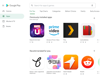
Some moron at the big G might call this new layout tablet optimized if they’re not allowed to question orders from their marketing overlords.

Me? I’d say why the !@#$ are you wasting nearly 2″ of my screen real estate to highlight the sections for movies and books? I don’t even want to look at my phone’s layout after seeing this redesign on my tablet, for fear of what else might be found.

I was really on the wall when hamburger design took over the mobile world but quickly came to like it, when it was done well. Interfaces like this however are just wasteful(tm). But it gives you plenty of space to write out Games, Apps, Movies & TV, and Books in something like 120 languages.

Samsung Galaxy Tab S6 Hands-On: Keyboard and S Pen.

I’ve never really been a big fan of Samsung’s cases, be them the flappy cover or the same with a keyboard stuffed in. But I’ve gotta admit that keyboard/kickstand approach makes an interesting case.

This also gives me some hope, since my Tab S3’s cracked screen ain’t going to get any better and the alternatives are rather few without migrating to an iPad Pro.